For this assignment I chose the cartoon Spongebob Sqaurepants. Usually in this cartoon they use very bright hues because it's generally a happy cartoon, nothing ever goes wrong except the usual Plankton trying to steal the Krabby Patty recipe. The hues in the first picture they chose were bright yellows, purples, and greens because the characters don't have a care in the world. They're just floating around blowing bubbles so they used these hues to create happiness. The second picture however, something tragic happens. Spongebob and Patrick take a train to a foreign place called Rock Bottom that is very scary and unknown to them and they can't figure out how to get back home. For this they still use the characters hues of pink and yellow, but they are faded. The background is very dark and uses grays and blacks.
The brightness and saturation are very different in these two photos. The first one is very bright and doesn't use any dark colors at all because it is a happy scene. The second photo uses all dark colors (besides the characters), but even the characters' bright colors are very desaturated and faded out.
They don't really use any shadows in Spongebob, but if they were to put shadows in these scenes there would be a lot more shadows in the second picture to resemble darkness and that they are in a scary place. The symbolism of the colors is that the darker colors resemble the scary, foreign place they are in. In the first picture the bright colors symbolize happiness which also puts you in these moods when you watch these specific scenes.
In the first picture the movements are very diagonal as opposed to the second picture all the lines are going parallel. There aren't many things in each scene so there are not many overlapping movements. The weight in the first picture I would consider light because it is using very easy colors to look at. The second picture is more contrasting with the different colors.
It's hard to tell if the director followed the 180 degree rule because the shots are very short and limited. Each shot is a somewhere new and with new actors. You can tell one place where he broke the 180 degree rule is in the second scene. When he shot the blue car, he shot it from the back end, then the very next shot you see the front end. It's confusing because one second the car is traveling away from you and the next it's coming toward you.
The director did follow the rule of thirds. He always has what he wants you to pay attention to in the right third. Whenever there is a car in the scene it's either traveling from the right third, going to the right third, or sitting in the right third. Sometimes he does break it and puts the characters right in the middle of the shot, but the scenes aren't supposed to be about the characters, you're supposed to be paying attention to the cars.
It's hard to decide whether the 30 degree rule is followed in this commercial because the shots are so short and limited. It seems like there are a few jump cuts in the commercial because there are some spots that it feels awkward, but the commercial and shots are short enough that they wouldn't be noticeable to a regular viewer.
If you pay attention to this commercial, the scenes that have multiple shots in them do seem awkward because they either have jump cuts or the example when the director broke the 180 degree rule. Overall I think the director did not pay attention to these rules when he was shooting a commercial unless there are different rules for car commercials.
For the song deconstruction song I chose two songs by Local Natives.
"Wide Eyes" by Local Natives
Listening Phase One:
Tempo: Vivace (lively and fast)
Source: Drums, bass guitar, lead guitar.
Groove: The groove is definitely coming from the clicks of the drums constantly going throughout the song.
Listening Phase Two:
Instrumentation: Drums, two guitars, distorted bass guitar.
Structure Organization: The song gets more intense as it goes on.
Emotional Architecture: The song keeps building with more things going on as the song goes on.
Listening Phase Three:
Height: varies, the guitar is very high but the distorted bass is very low.
Width: no panning.
Depth: five layers of instruments playing different things at the same time, makes the song very loud.
"Who Knows Who Cares" by Local Natives
Listening Phase One:
Tempo: Adagietto (Rather Slow)
Source: drums, bass
Groove: The groove is coming from the drums and keyboards.
Listening Phase Two:
Instrumentation: drums, two guitars, bass guitar, keyboards.
Structure Organization: The song gets more intense as it goes on.
Emotional Architecture: The song starts of very slow and then ends up rather fast towards the end.
Listening Phase Three:
Height: high
Width: no panning.
Depth: song starts off with very few layers then ends with a lot.
Between the two songs, I definitely like Wide Eyes better because it has a lot more going on in the song, there are many layers, and there is a constant drive behind the song. I purposely used the live performance for the second song because it shows you how many layers they use and personally I like the live version better even though the song quality is less impressive than the real version of the song. Another reason I like the live version is because you can actually see the audience's reaction to the song and what the musicians are putting into the song while they are playing it.
With both songs I don't think the lyrics are the main focus. I've been listening to these two songs for over a year now and still don't know all the words which is rare. Your attention is drawn more with what the instruments are doing. After looking up the lyrics, I like "Who Knows Who Cares" better because the lyrics are more relatable. The lyrics in "Wide Eyes" don't really make sense.
I feel like "Who Knows Who Cares" is the anthem of Local Native's album. It's slower than most of their songs but it still has a drive to it. "Wide Eyes" is considered their single for their album and is more upbeat than the rest of the songs.
My favorite parts of both songs would be the lead guitar. I like the clean sound it has opposed to the distorted bass in "Wide Eyes." Each song multiple guitars playing unique guitar riffs the whole time, both using the clean sound that you expect from Local Natives. Another thing I like in both songs are the drive of the drums. The drummer does not use typical drum patterns in any of their songs, so during the song you never tune-out the drums, they are always obvious and present whenever they are playing.
Overall "Wide Eyes" would be my favorite out of the two. Using unique instrumentation and multiple layers of all instruments keeps my attention on the song and I haven't gotten sick of hearing it yet.
TWO SEVEN YEAR OLDS ride in backseat as a YELLOW BEETLE drives by. One punches the other.
LITTLE BOY
Yellow one.
BLUE JETTA turns left at intersection. WOMAN in city bus punches the DRIVER in the arm.
WOMAN
Blue one.
TWO 40 YEAR OLD WOMEN power walk in their neighborhood past a driveway with a RED JETTA STATIONWAGON. One punches the other.
Powerwalking woman
Red one!
WHITE VOLKSWAGEN SUV passes a SHERIFF CAR with TWO SHERIFFS inside. Sheriff punches the other.
SHeriff
White one.
Other sheriff looks over, annoyed.
GIRL gets punched in mini-van in arm. GUY punches GIRL driving a convertable.TWO people stand in the rain, one punches the other as a red car drives by.
BLACK MINI VAN drives by as LITTLE BOY punches GRANDPA in leg.
LITTLE BOY
Black one!
Grandpa screams.
SILVER CAR drives by ambulance and parks as a nurse inside the ambulance punches the other while taking care of patient.
NURSE #1
Silver one.
Guy punches girl in arm. Waitress punches man in arm as he holds coffee and spills it.
BLUE CAR shown.
Woman in car in labor breathing hard as car drives by deep punches husband.
PREGNANT WOMAN
Green one.
RED CAR drives past AMISH BUGGY. AMISH punches the other.
AMISH
Red one.
TWO GUYS in messy party clothes, guy punches passed out friend.
GUY
Green one.
Girl punches girl, guy gets punched in the tattoo. TWO GUYS putting wetsuits on, one guy punches his friend, the friend falls down.
GUY
White one.
FALLING DOWN GUY
Dude!
RED JETTA pulls away from curb.
STEVIE WONDER
Red one!
Stevie Wonder punches TRACY MORGAN.
TRACY MORGAN
How do you do that?
STEVIE WONDER
Ha.
TRACY MORGAN
Ha nothing! How you did that?
STEVIE WONDER
I said ha!
TRACY MORGAN
Alright!
Volkswagen ad at the end.
Deep voice (V.O.)
With thirteen different models, it's a whole new Volkswagen, and a whole new game.
FADE OUT
(Sorry I couldn't figure out how to export from Celtx so it's not in the correct script format)
I just used a commercial for my script, but it still has sound design involved even though it may be simple. I would say that most of the sounds are literal. Most of the sounds are either people talking or punching each other besides the music in the background. I would say the sources of sound are non-diagetic because although there are punching noises, talking, ambulance noises, there is also music in the background that the characters wouldn't be able to hear in the scenes. There would be limited sound in this commercial because most of it is the music in the background and foreground noises such as people talking.
Finding Your Howl by Jonathon Flaum starts off talking about a pack of red wolves that get taken into captivity because they are endangered. They are in captivity for so long that when released into the wild, they forget how to howl. They didn't need to howl in their cages or hunt because they were fed on schedules everyday so basically they forgot to be wild animals. The wolf kept going through obstacles to try to learn how to howl but could never get it. The moral of the story is that you will always have a barrier to overcome to get want you want and once you overcome a certain barrier there will be several more after that. For instance, the tiger in the story Jonathon told where he kept escaping from the cages at the zoo and would just end up in another cage relates to life. Your personal cage never disappears, but there are ways that you can escape it and 'find your howl'.
"My mother said to me, 'If you are a soldier, you will become a general. If you are a monk, you will become the Pope.' Instead, I was a painter, and became Picasso." - Pablo Picasso.
This quote means something to me creatively for many reasons. First, I take it saying that if you work hard enough at something you will end up at the top such as starting as a soldier and ending up a general or starting as a camera-man, intern, or assistant and ending up being director. If you work hard enough at something, it will pay off at the end. Like the 'Finding Your Howl' blog, you have many things and "cages" you must overcome in life to reach your goals.
This quote also represents what I'm trying to accomplish with being in a creative major because instead of just taking the typical route and wanting to be a teacher, or sit in a cubical and work a 9-5 job I'm doing something different. Instead of being a soldier or general, Picasso wanted to be different and became a painter, so he made a name for himself because he worked hard and stood out.
For the hero, the background of the picture will be the American flag because he protects his country. He wears a navy blue suit which represent the blue on the flag. Instead of using white or red for the other colors of the character, he will have a darker green as well similar to the statue of liberty staying with the patriotic theme. The colors red, white, blue, and green represent the character's patriotism, strength, and shows that he will stick up for his country.
For lighting, the character will have all light on him from all directions so he has no shadows and the audience pays attention to him and not what's behind him. The focus should always be on him so that is why he is lit so well. He will not have shadows because shadows represent evil.
For shape I wanted the hero to be square shaped to represent strength and for the villain to be set back by his muscles and strength.
VILLAIN
For the villain's colors, I chose for his colors to be browns, grays, and blacks to represent the desert. He is a terrorist, so he is from overseas trying to attack America, so we made him be from the desert and his colors represent that. Using these dull, dark colors also make him look evil rather than the bright hues on the hero.
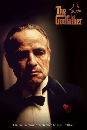
For lighting of the villain, I used inspiration from The Godfather. In the Godfather as you see above they are very poorly lit to add more suspense and mystery to the characters. Another thing I wanted to focus on with lighting is the eyes, in The Godfather as well as many other movies, the eyes are very poorly lit. You can't see the iris or pupils in the eyes, just a little sliver of light and the rest of the eye is black.
For the villain's shape, I decided to make him look weak/old so I gave him a circular shape. Not very muscular, doesn't have a strong posture, and would not be intimidating.