HERO


For shape I wanted the hero to be square shaped to represent strength and for the villain to be set back by his muscles and strength.
VILLAIN

For the villain's colors, I chose for his colors to be browns, grays, and blacks to represent the desert. He is a terrorist, so he is from overseas trying to attack America, so we made him be from the desert and his colors represent that. Using these dull, dark colors also make him look evil rather than the bright hues on the hero.
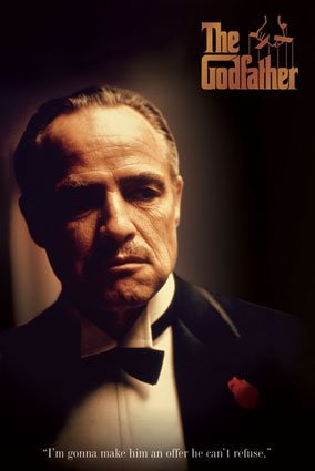
For lighting of the villain, I used inspiration from The Godfather. In the Godfather as you see above they are very poorly lit to add more suspense and mystery to the characters. Another thing I wanted to focus on with lighting is the eyes, in The Godfather as well as many other movies, the eyes are very poorly lit. You can't see the iris or pupils in the eyes, just a little sliver of light and the rest of the eye is black.

For the villain's shape, I decided to make him look weak/old so I gave him a circular shape. Not very muscular, doesn't have a strong posture, and would not be intimidating.
No comments:
Post a Comment